Sunday, June 30, 2019

Vegan art supplies

It has been far too long since the last time I wrote anything on either of my blogs (this and the Finnish one). I stopped doing blog posts due to lack of time and energy but there are times when I've really missed writing. I also miss the thought of at least one person getting something out of my texts. I'm planning to write to my blog again here and there and in addition to art I will also focus a lot on nature conservation and making ethical choices in your everyday life.

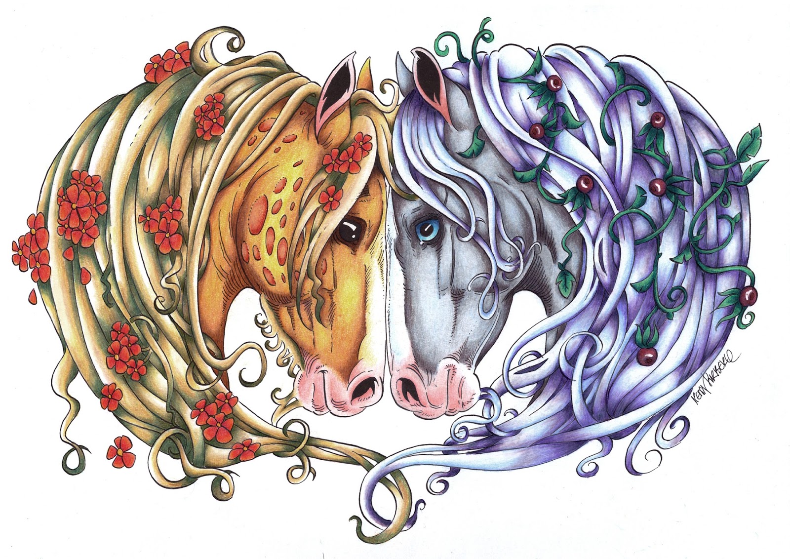
Right now I want to talk about vegan art supplies. This is something that I discussed with at least a couple of people before but the blog post never happened. I'm sorry.

There are already a lot of blog posts out there that list vegan-friendly art supplies. However, most of those handle the big, known brands and are mostly centered around the selection available in the US.

Disclaimer!

I'm not vegan. I'm just someone who tries to be more conscious of what I buy and how I spend my materials. I support environmentally friendly companies and try to use my supplies to the best of their abilities and recycle what I can. But I'm not perfect. I still use disposable products that contain plastic for example. Art in itself is never sustainable. The main point of this blog post is to raise awareness about eco-friendly companies and supplies.

Things to look out for

So do the supplies you're about to purchase contain animal derived ingredients? Some things to look out for are:

- Bone black pigment (pigment made from bones, used in a lot of black pigments)
- Gelatin (animal glue, used to coat watercolor papers to make the surface more durable)
- Animal hairs in brushes
- Ox gall (used in watercolors to improve the flow of the paint, even sold in separate bottles)

There are a lot of other animal ingredients. Most companies have some kind of separate vegan list or they make the statement in the product description itself. It's also worth it to pay attention to certificates. FSC being one example. It tells you that the wood that's being used in the making of the product is harvested from sustainably managed forests. Faber Castell, for example, operates under this certificate.

A very good and extensive list of vegan art supplies can be found here: https://doublecheckvegan.com/vegan-art-supplies/

My vegan supplies

Rather than listing everything out there (there are already a lot of those lists) I'm going to go through my selection of supplies. These supplies aren't that rare or hard to get. At least inside EU. The prices aren't bad either. I don't want people to think that in order to buy environmentally-friendly and vegan art supplies, they have to pay an arm and a leg. I work mixed-media using watercolors and colored pencils.

Graphite pencils: 

I've used Staedtler Mars Lumograph pencils for a long time. They are very easily available and the lead is very durable and smooth. I'm not 100% sure if they are vegan but the company cares deeply about nature and sustainable production and the wood they use is FSC certified. Considering the fact that graphite is not an animal-based ingredient, it's safe to say that the pencils are vegan.

Another safe bet is Faber Castell. I have some of their pure graphite sticks and they are awesome. The 9000 graphite pencil range is easily available. Faber Castell also has mechanical pencils and clutch pencils.


Fineliners:

My favorite fineliners are Pigma Microns which are vegan. They are lighfast and waterproof and are very easily available. Pretty cheap too. They come in several different colors and sizes and there are also brush tipped pens available.

Another safe bet is, again, Faber Castell. They have fineliners, brush pens and big brush pens.


Colored pencils:

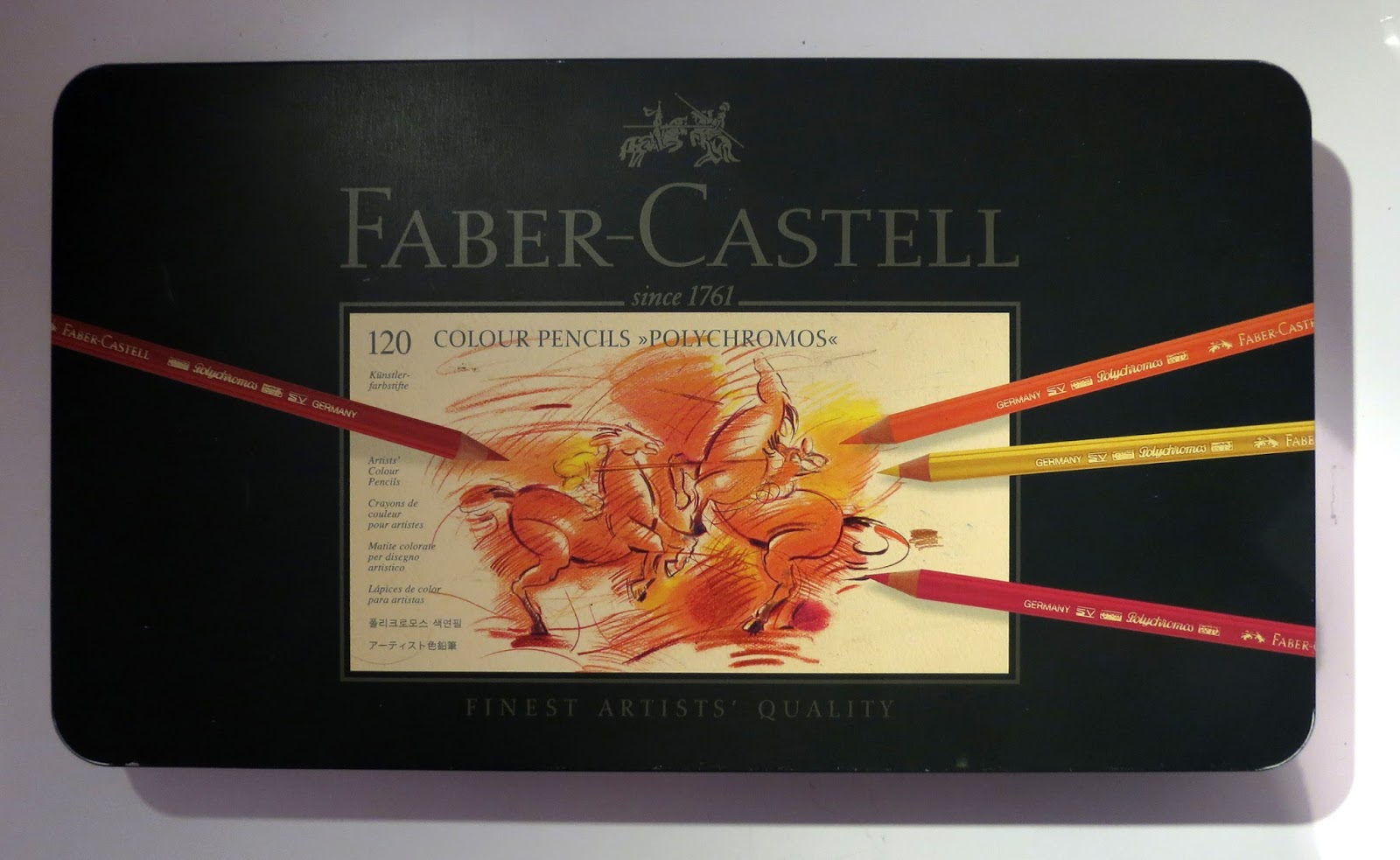
I use Faber Castell Polychromos. These are professional-level oil-based pencils that layer beautifully and the full set has 120 colors. For us Europians these pencils aren't expensive at all. You can find the sets in most places and if you're struggling to find a retailer with open stock pencils, you can always check out Jackson's Art Supplies. They have world-wide shipping. Faber Castell produces vegan friendly supplies and operate under FSC certificate.

I also use Caran D'Ache Luminance pencils to compliment my Polychromos. These are highly lightfast, wax-based pencils. The full range consists of 76 colors. The pencils are vegan-friendly and the company operates under FSC certificate. Luminance pencils are a great compliment to oil-based pencils as being wax-based they blend a lot better and the white pencil in particular is amazing for blending and bringing shades a bit lighter.

Faber Castell Polychromos. Set of 120.


Derwent InkTense:

I like to use InkTense by Derwent for less serious projects like greeting cards and coloring book works. The lightfastness is a bit of an issue but as Lisa from Lachri Fine Art has stated several times, you can always make prints out of the finished illustrations. Both the pencil line and the block line has been stated to be vegan-friendly. Both ranges consist of 72 colors.

InkTense blocks. Set of 72. Cover illustration by Lisa Clough from Lachri Fine Art.


Watercolors:  

Back in the day I started out with RoyalTalens VanGogh watercolor paints. These are student-grade paints but don't let that fool you. The colors are highly lightfast and the paints perform very well. They are available in half-pans and tubes. I recently purchased a few tube colors since I've never tried tube watercolor before. The current range consists of 72 colors with the special Dusk, Metallic and Interference colors having been added to the selection.

After using my VanGoghs for a while I stepped up to their professional range of Rembrandts. These professional-level watercolors are very reasonably priced and all colors layer very beautifully. I bought the 48 color half-pan set and added a few colors to my selection. I now stand at a whopping amount of 52 colors. It wasn't exactly free to buy this many colors but the price was way WAY lower than it would've been for, say, Schminke watercolors which contain ox gall. Rembrandt color range is also highly lightfast so I didn't have to stick my nose to the color chart trying to dodge weaker or even fugitive colors. The full range consists of 120 colors (the color chart on their site is brand new, the series is undergoing renovation right now).

Both RoyalTalens watercolors are vegan-friendly (except for the color Lamp Black) and do not contain ox gall (verified by RoyalTalens representative).

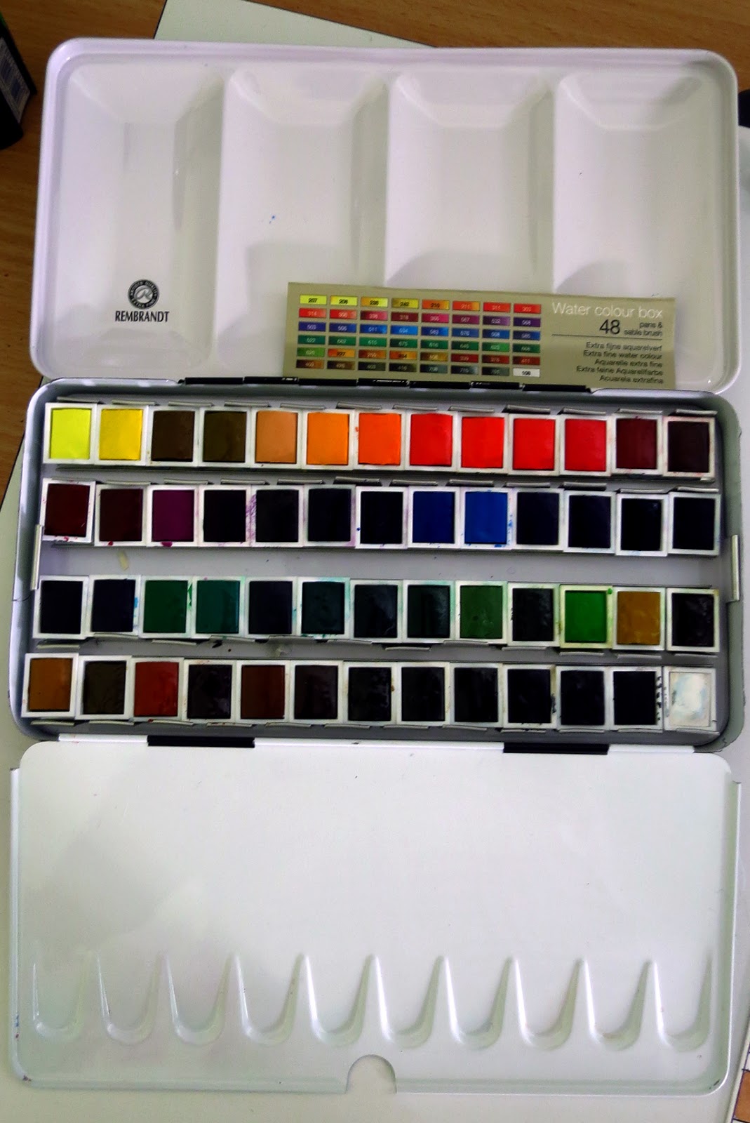
My set of Rembrant watercolors.
Some VanGogh watercolor tubes that I recently bought.

Brushes:  


The vegan information for brushes is surprisingly hard to find. I didn't really find any dead-set information about the brushes that I use. However, the main point here is to use synthetic brushes. There's a huge selection of synthetic brushes available these days. Just make sure the brush really is synthetic and not, for example, a synthetic-natural hair mix. I personally use ProArte Prolene Plus brushes, Escoda Perla brushes and I also have an Escoda Ultimo mop brush. Jackson's Art Supplies states that their synthetic studio brushes are vegan.
Some of my brushes. Escoda Perlas, Escoda Ultimo Mop and ProArt Prolene Plus brushes. All fully synthetic.
 

Misc. supplies:  


I use a bunch of other supplies that I'd rather not list separately. In general, when buying miscellaneous art supplies like erasers, sharpeners, containers etc. just pay attention to the company making them and get as much use out of the supplies as possible. I use regular erasers very little and the ones I have are from Faber Castell or Caran D'Ache. I prefer to use a kneaded eraser. I use one eraser for years. Literally.

I use Staedtler can sharpeners most of the time. This is a bit of an annoyance since they are disposable and made of plastic. The sharpener itself doesn't last THAT long. I'm actually considering moving on to those small metal sharpeners and getting a big container to store my pencil shavings. At least by doing that, I would be able to toss the dulled out sharpeners to metal recycling bins. I have a Jakar crank operated table sharpener but I find that it just chews through my pencils way too aggressively.

I have plastic water cups. But I've used those for years and once I'm done with using them, they will go to plastic recycle bins now that we have those in Finland. For palettes, I use porcelain.

Now masking fluid is tricky. A few sites did claim that Pebeo Drawing Gum is vegan but I'm not 100% certain. The annoying thing about masking fluid is that it goes bad relatively fast. Honestly, you're better off learning how to paint around your subjects whenever possible.

Then there are other things like solvents, fixatives, white inks. I personally don't use solvents for my colored pencil work. I never got it to work for me and I started to use watercolor underpainting instead. I know there's stuff like Zest-It which is supposed to be non-toxic. The official version smells utterly horrible and gave me migraines. The citrus-free version is far more neutral. I just feel very eery about solvents as a whole and I want none of that stuff in my home, on my skin or close to my indoor cat or asthmatic fiancé.

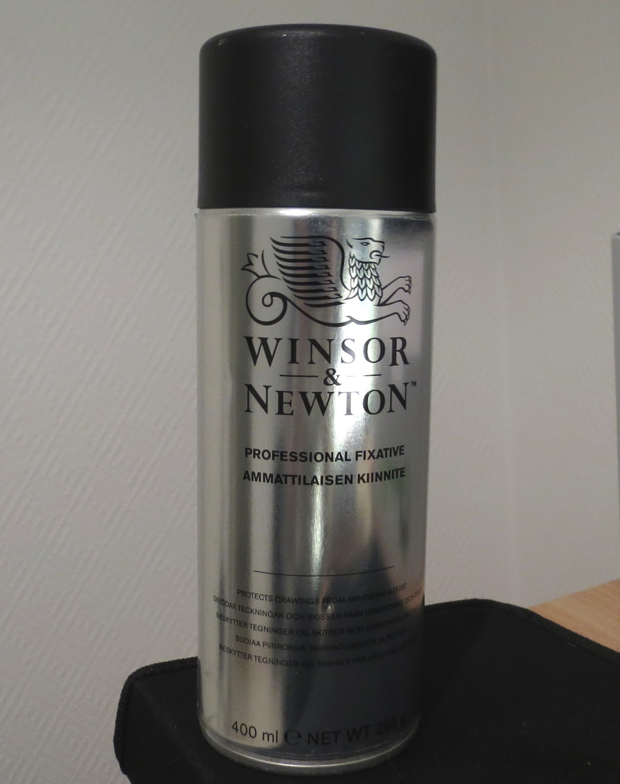
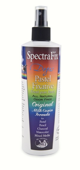
Fixatives are another very difficult subject. There's SpectraFix which is a milk casein based natural fixative. The problem with this fixative is being able to spray it evenly. It can produce very large globules. It's also very wet so keep it away from lighter papers. People have had some success with those new spray cans that develop an even mist when pumped. I need to try that in the future. Then there's Brush & Pencil Final Fixative which is non-toxic. However, getting this product to Finland costs an arm and a leg in shipping. I have tried the Textured Fixative though and it also has a tendency to spray large, uneven globules. The thing about fixing your works is that you simply don't want to ruin hours and hours of work by using a bad fixative. I've used Winsor & Newton Professional Fixative for years. I do feel bad about using it but I just haven't been able to find an alternative. The best thing I can do is to ensure that I use a can to the very last drop, then recycle the can.

For white ink details I like to use Aerocolor ink by Schminke and FW Acrylic ink by Daler Rowney. Both are listed in some vegan lists. I also have Uni-Posca white paint markers and I've seen these in some vegan lists. I'm not 100% sure about either of these though so you'll have to re-check yourself.

Some miscellaneous stuff.

SpectraFix natural fixative.

Papers:  

Now this is a big one. Paper manufacturing is never quite environmentally - friendly but by choosing and supporting companies that strive for sustainability you're already helping.

With watercolor papers in particular, you might come across the term 'sizing'. This means that the surface of the paper is sort of sealed so that it handles water better and does not get damaged so easily by masking fluid or scrubbing. The problem is that a lot of papers are sized with gelatin which is animal glue made through the process of boiling different animal ingredients like bones.

https://www.peta.org/about-peta/faq/what-is-gelatin-made-of/


!!! Some well-known and popular papers like Arches and Saunders Waterford contain gelatin. !!!

Here's a list of paper manufacturers whose papers I use. Specific papers that I have are listed in brackets. All these companies make vegan-friendly paper and support sustainable manufacturing:

- Hahnemühle (Nostalgie, Anniversary, Bamboo mixed-media, Grey Book, Britannia hot press)
- Fabriano (Fabriano 5 HP old surface, Fabriano Artistico is also very popular)
- Canson Moulin DuRoy hot press
- Stonehenge Aqua hot press (my go-to paper)
- Strathmore (Bristol Vellum & Smooth, Mixed Media in white, tan and grey)


Hahnemühle Bamboo mixed media, Hahnemühle Anniversary, Hahnemühle Nostalgie and Starthmore Bristol Smooth.

For sketching I use several different papers like Daler Rowney smooth heavyweight cartridge paper or a Finnish drawing paper that is produced by a Finnish company who uses local forests and complies to environmentally friendly production. I've also started to work digitally at the drawing phase. Yes, this uses electricity but saves in paper waste since I can just re-work the drawing as much as I want. I use a black & white laser printer. By using a laser printer I don't have to buy ink cartridges all the time and I'm only using black color.

These are the supplies that I personally use. If you use any other medium like acrylics or oils you can easily find information and articles. Here's a great article made by Jackson's Art Supplies:

https://www.jacksonsart.com/blog/2017/03/08/art-supplies-animal-ingredients/

Ending note


As I said in the beginning, art is never environmentally friendly or sustainable in itself. But you can make smarter choices:

- Support environmentally friendly companies that state their principles and certificates clearly. If they give out information freely and openly, they have nothing to hide. If they are reluctant to give information, they're probably on the sketchy side or they just don't care.

- If you're uncertain about a product, ask the company! If they care and want to reply, they will. You might have to try different channels. For example Royal Talens replied to my inquiry on Facebook and Derwent replied very quickly on Instagram.

- Try to get the best out of your products. Use the stuff you buy to the last drop. I'm a horrible paper hoarder. I've made the decision to NOT buy any new papers or sketchbooks until I've used up most of the stuff I have in my closet. This might as well take me the rest of my life :D

- Recycle everything you can. Metal parts, plastic, paper (!).

- Try to buy locally from inside your own country. Not only will you support local companies but you will also lessen the burden of logistics. Thankfully, I can now buy most of my supplies from Finland.

- Try to find your favorite tools and stick with them. Jumping between mediums is expensive, taxing and it easily creates a situation where your closet is full of supplies never to be used again. I've been guilty of this more than once. Try to sell the ones you didn't like or maybe consider donating them to a school or community college. You can also keep them around so you can give them to someone as a gift. Don't just dump them in the trash!

- If using digital tools, try to be smart about it. You can transfer your reference photos to a smart phone or a tablet and use those instead of keeping your computer running. I have a relatively powerful gaming computer and I'd rather not keep it on all day if I don't absolutely need it. If you have a good amount of daylight, use that as your light when you draw and paint. No need to keep the lights on all the time.

- If you want to make prints out of your artwork, consider using an external company. They already have the hardware and the inks to produce the products that you want. No need to go out there and buy a new printer, new inks and all that paper.

- Try to search the internet for tutorials and videos rather than buying a new book every time. I have way too many books myself. The internet is incredibly vast and packed with information. Accessing that information is easier than ever. So use it.

Thursday, May 31, 2018

Those small drawing tips

 As much as I love coloring and painting, drawing is something I dread. It's definitely my weakest spot as an artist. Drawing is a difficult skill in that it requires constant practice. And not just blind, random practice but actual constructed practice where you pay attention to techniques and how things work. Everyone is different and learns in their own way but here are a few general tips that have helped me.

1. Just draw

As much as it annoys you when better artists keep telling you this but it really is the truth. You won't get better if you don't actually draw. If you follow your drawing patterns for, say, a month, and write down the hours you spend drawing how big of a total do you get? Could it be more? I know I personally draw far too little. Reading about drawing won't give you those 'oooooh so this is how it works' - moments that the actual doing it in practice does. Buy a sketchbook and just draw in it. You don't have to show your drawings to anyone.

2. Don't stick to just one subject

We all specialize in something but sometimes it's worth it to reset yourself and try something else. I've never drawn humans myself but I felt very frustrated about my art and drawing skills so I decided to completely shake things up and started to learn how to draw a human faces from photos. Next I might try my hand at landscapes as I've been wanting to get better at backgrounds for the longest of time but have never really focused solely on drawing environments.

Still-life drawing can be a great change from drawing living subjects like humans or animals. Still-life drawing improves your accuracy and the ability to measure angles, distances, proportions etc. Reference image is from WetCanvas Reference Image Library.


3. Whip out those references

Despite of what you keep hearing online from people who supposedly 'know stuff', using references is not cheating. Seriously, it is not cheating.

Professional artists use references all the time. The human mind is very limited and unless you have some magical, photographic memory, you can't possibly remember everything you've ever seen in enough detail to replicate it through drawing or painting. Also, when you draw from your mind, you're drawing your idea of the given subject. The idea in your head might be completely different than what the subject actually is in real life. People often use a tree drawing as an example of this. If you're given a task to draw a tree from your mind, you have a tendency to draw a straight line for the trunk and then a piece of cotton candy for the leaves. This is the symbol of a tree.

However, if someone makes you sit in front of a real tree and asks you to draw it, the task becomes far more daunting. But at the same time your drawing will be more accurate because instead of thinking you're going to draw the symbol of a tree, you're actually drawing the tree itself, right there in front of you.

Your drawing of that particular tree will be your interpretation of the reality you see before you. And that's art. If you want your interpretation to grow more accurate, you need to study the reality more. There's no real way around this.

Do keep in mind that whenever you publish referenced work, you should give credit to the person who provided the reference. Also, before making an actual artwork out of a reference, make sure you have the permission to use the image to begin with!

Some long-tailed tit studies I made for a card design. I was trying to feel out the general shape of the birds and figuring out what their main characteristics are. And yes I write my notes in English. It just flows better.

4. Measure, check and double check

When we want to draw accurately and are using references to do so we have to be able to see what it is that we're drawing. This is more mathematical than one would think. Angles, distances, proportions and measurements are important when drawing a likeness.

First things first, it's good to think about a composition and the size of your drawing. I used to overlook the size but once I started to get better at art I also started to do greeting cards a lot. It quickly dawned on me that I can't just do them blindly in random sizes. They have to fit the envelopes and if I do folded cards then I have to make sure the paper size is big enough so the sides will be of equal size. Framing is another thing to keep in mind.

When you have a composition and size in mind, it's far easier to design and draw. It also eliminates a part of the fear of blank paper. At least you have a frame to work on.

After this you'll want to measure the main parts of the composition. The horizon line, the placement of the most important objects etc. Once you've placed the biggest main shapes you can start to measure the elements and details inside them.

For the human face this could be the guidelines to define the angle of the head, the placement of the center line, placing guidelines for eyebrows, eyes, nose tip, mouth etc. Although no face is 100% symmetrical, there are basic guidelines and parts that relate to one another. Ears tend to align with the eyes with slightly angled lines. The brow and the eyes are connected and move together. Eyes are nestled atop of your cheekbones and the movement of cheekbones also affects the shape of your eyes. The nose is nestled between the cheekbones and the ridge of the nose starts from between the eyes. If you don't measure the width of the nose in relation to the eyes, things will look off.

The height of the lips aligns with the part of the jaw where it starts to slope inward because if you think about it: What is inside your jawbone? Your mouth, naturally. It might seem a bit of a 'doh!' fact when I say it like this but with drawing things might not always appear so clear. You try and try and you try to get a thing right and keep thinking, 'why does this look so weird?!' until you realize the reality behind putting stuff on paper. And this only comes with practice.

Of course, these rules are there for you to play with. But when you're just learning, becoming aware of these guidelines is important. You can't break the rules if you don't even know them yet.

A face drawing practice. It's not perfect but I tried to focus on getting things accurate. I carefully measured everything and tried to keep in mind how the different elements relate to one another. Once I had finished, I realized that the eyes are far too much at an upward angle. An old habit from drawing elves as a kid. Reference photo by blackpoolstudio at DeviantArt.

Also, when you've been hacking at a drawing for a long time, you tend to become blind to it. This is where checking the correctness becomes important. If drawing digitally, you can just flip the drawing horizontally whenever you want. With traditional drawing however, you need to turn your drawing around against a light source or then view it from a mirror to check for errors. I prefer the mirror as it also shows my drawing from a bit further away.

5. Don't be afraid to start messy

A clean finish is something that I obsess about. I want my finished artwork to have this smooth, soft finish to the point of trying to make things almost pristine. However this doesn't translate well to drawing. Especially when starting out.

When planning a drawing, you most likely don't have a clear idea in your head from the get-go. So you need to plan. Do thumbnail sketches, feel the shapes and the gesture and the overall composition with your pencil. I sometimes like to use a pure graphite stick for this as they give out looser strokes.

Your drawing will be full of messy strokes, ugly lines and will most likely smudge with graphite. This is OK. Really, it is. If you try to start super clean and with as little strokes as possible, chances are that your drawing will be incredibly stiff and lifeless if you even manage to whip out a drawing.

Relax and choose a paper you can mess around with. Don't do the first draft on your super expensive sheet of Arches. Once you arrive at a draft you're happy with, you can trace it onto your paper of choice later. Yes, this is a slow and arduous process. However when you have several drafts, you can never really mess up. You can always go back.

I've started to use scanning and Photoshop to my advantage. I scan in my first draft, adjust the size to my needs, adjust the Levels so the lines are darker and then print it out with my laser printer. Then I can use my light table to trace it onto different papers as many times as I want. Because of this method, I can also do color studies before I actually get to work.

It does take a long time to work like this but in traditional art we don't have the undo button so this really helps with relieving stress.

A first draft for a kitten birthday card. The reference photo is from Pexels.

I shrunk the draft a bit in Photoshop to fit it into A5 size. The I printed it out and traced it onto cheap watercolor paper in order to do a color study. The result is messy but now I have a better idea of the colors I want to use.


And that's it. As I said at the beginning, everyone learns differently. But those of us who aren't super confident and tend to obsess over the end result, a little help goes a long way. My method of drawing is sloooooow. But I like to think of it as a safety net. Maybe these points can help you in creating your own method of working.

Wednesday, April 25, 2018

Coloring book tutorial - Coloring

Now that we've covered the basics in part 1, it's time to put those techniques into practice. To refresh your memory, here is the image that we will be using as an example. A unicorn drawing from Lena Furberg's Måla Magiska Hästar - coloring book:

A unicorn coupled with some flowers, butterflies and a couple of humming birds.
Before putting pencil onto paper it's a good idea to look at the image for a while and think about a color scheme. Day or night? Cool or warm? With highly detailed images like this one it's also worth thinking about what color you want the flowers, the berries, the butterflies, the hummingbirds and the unicorn to be and how those colors relate to one another. If you keep repeating the same colors for different elements, your image will look dull and monochromatic. If you use random colors without any attention to color relations, things will look messy and unorganized. I don't keep a color wheel next to me when coloring but I do try to think about things like complementary colors. Color temperature is another thing to pay attention to. A cool red is a very different color than warm red.

I always find it the easiest to start with a flat color on the background. I consider this the most arduous part of the coloring process so it's good to get that out of the way when we're still full of energy. When starting out with a new image it's easy to feel impatient and wanting to turn it into a masterpiece ASAP. But it doesn't work that way.

Very basic, flat blue background added.

Here I have colored the background light blue. This took around 3-4 slowly and patiently colored layers. In order for a background to look as smooth as this, you need to be very patient when covering the paper. There is no way around it. If you put too much pressure on the pencil to try and make the color darker or you try to color the whole thing with random, hasty strokes you will get an ugly, uneven coverage and you won't be able to blend with cotton swabs.

Use a very light pressure and carefully cover the paper with circular strokes. Sharpen your pencil whenever you need to. The tip doesn't have to be super sharp since it can potentially scratch the paper but if it's too blunt, it might submit the pigment in blotches. Also, try to keep the pencil a bit tilted to cover the paper more quickly. If you keep your pencil in a writing position then you might scratch the paper and you will only be able to cover a very small area at a time.

Once you're done with a layer, blend it lightly with a cotton swab or a pad if you want even softer coverage. Again, don't rush. You need to cover the whole thing. Go over this process as many times as you need.

Powder blending: I use this method a lot for backgrounds like this. You can take an X-Facto knife and carefully and lightly scrape pigment from a pencil-lead onto the paper. Then blend that pigment with either a cotton swab or pad depending on the coverage you want. Here I used a cotton pad because I wanted the coverage to be as even as possible. I first used white pencil powder to even the color work. Then I used light blue powder to finalize the flat coloring and up the saturation a bit.

But OMG I'm butchering my dear pencils when doing this!

In a way, yes. However you can't worry like this when doing art. You bought your pencils to be used. They want to be used. Wasting my supplies is something I used to worry about but I eventually realized that I will not be able to produce good artwork by worrying about stuff like this. Once you're done with scraping the powder, just sharpen your pencil a bit and it will be OK again.

Now the leaves and the flower stalks.

Still working on the background, I moved onto the leaves and flower stalks. I was already throwing ideas about the colors I wanted to use for the different elements so I decided that I want the tree leaves to be a cooler color and the flower stalks to be a warmer color. So I used cool, bluish green on the leaves and a warm yellowish green on the flower stalks.

Again, use light pressure and circular movements to get soft, even coverage. This coverage took around 2-3 slow and patient layers.

Leaves and stalks after shading.
Here I have finalized the shading of the leaves and stalks. I started to darken the elements from where I wanted the shadows to be. I would use a combination of different greens, blues for the shaded areas and yellows for the lighter areas. Here the very first, basic layers are important because they can completely change the end color. I did use same colors for shading both elements to bring them together but even then the leaves resulted in a bluish green and the stalks in a yellowish green because the base layers shine through. Colored pencils are semi transparent. This is why the first layers are so important.

Usually with shading you should choose a light source and color accordingly. However I tend to kind of wing it with coloring book pages as they tend to be rather 2D. So I just go with the flow and try to add shadows where I think they might fit in.

Don't be afraid to go rather dark where you want the darkest areas to be. If you stop shading too early, you will end up with a dull, monochromatic look. Also, do not shade with only a darker shade of the color you're already using. It won't work like that. Try using blue shades for cool shadows and yellow shades for areas that are exposed to light. If you really want to play around and experiment, don't be afraid to use purples or reds or browns. Try to think about complimentary colors. Using a dark red on a blue shadow can really deepen the effect.

I actually use Dark Indigo and Payne's Gray a lot when shading the deepest shadows. But I never use those alone. I always try to shade them further with complimentary colors since by themselves they can look very dull.

I added a hint of brown to the branches on top since those would've looked a bit weird as green.

Once I start feeling happy about the end colors, I burnish things lightly with a white Luminance pencil to smoothen everything. I might have to go over some colors again since the white pencil lightens the colors.

Now it's time for the additional little elements.
Next I moved onto the extra background elements. I visioned the leaves and the berries on top as a cherry tree so I colored the berries cool red. I used purples and a bit of indigo for the shadows on the berries. For the flowers I went with the idea of a boreal vetch so I colored them purple. For the top flowers I used a color scheme from an earlier coloring book image and went with yellow and pinkish tones so they would stand out from the blue background.

With the flowers I was a bit more careful with the shading as flower petals don't really reflect light that much. Super shiny and shaded flowers would just look plain weird. It's always worth it to think about the object you're coloring and how it behaves with light. A shiny, waxy leaf looks completely different than a velvety flower petal.

Next I colored the butterflies. I actually had a bit of trouble with them. The moth on the left was a no-brainer but the other butterflies caused me some head-scratching. At first I colored two butterflies yellow (thinking about a common brimstone butterfly) and two butterflies orange with black accents (thinking about a small tortoiseshell butterfly). The last two butterflies were first colored with purple. But once I stepped back and looked at it, I wasn't impressed at all. It just looked off. So I erased as much color as I possibly could and re-colored them orange.

After this change the colors looked more unified and logical. Also the yellow and orange colors stand out from the blue background.

Again, with the butterflies, I didn't just use one single color. Instead I mixed the orange up with yellows and reds to give the colors some life in them. I used browns for their bodies and dark red for the eyes of the bigger butterflies.

Next I colored the hummingbirds using the male Anna's hummingbirds as a model.

At this point I also colored the unicorn's horn. After some consideration I decided to go with a yellowish brown/gold color. I was thinking about making the unicorn white at this point so I kind of felt like this would be a good idea and the golden tone also stood out well against the blue background. I used a combination of natural yellows (Naples Yellow and Yellow Ochre - range of Polychromos), some Green Gold, yellowish browns and purples for shading.

Golden, natural tones are a bit of a handful to color. If you use the 'real' yellow range, you can easily end up with a blinking neon sign. So I tend to reach out to Ochres and Naples Yellows whenever I color something like this. This is why it's so important to know your pencils and know at least some color theory. It helps to know how different colors behave and layer with each other. The Luminance - line also has some amazing light neutral tones and because the pencils are wax based, they burnish and blend at the same time when you use them.


As a last step I colored the bit of flower hanging from the unicorn's mane. Almost missed that one.


Now we can move on to the unicorn.
During the early stages I had the idea of a white unicorn. But as I kept moving on with the background I realized that a white unicorn with subtle shading would look rather boring. Also, I would've had only two choices with the mane:

Either a gold - toned mane that would fight for attention with the orange butterflies. Or a silver - toned mane that wouldn't have stood out from the light blue background.

So I browsed the internet for a while and I stumbled upon a grey dapple unicorn. I found an image of a unicorn with a golden horn, gray fur and a dark mane and I was sold. And so I was able to move on again.

I used cold greys as the undertones and kept darkening them up, adding some Payne's Grey and Indigo for the darkest shadows and then went over the grey tones with a pale blue (Ultramarine) and bluish Luminance greys (Silver and Steel) to give it a bit more lively tint. The problem with greys is that they are very very dull colors when used on their own. This applies to black as well. One should never use pure black or pure greys for shading because those colors are simply devoid of any life. But tinting them with pure colors like blue or red can make all the difference.

I colored the unicorn's eyes blue and the snout and ears pink because for some reason I do that every single time when coloring light colored horses☺

Moving on to the rest of the body.

Here you can see a perfect example of a fully tinted head compared to the body where I have only used the grey undertones. A huge difference, is it not? Here you can very blatantly see how incredibly dull the grey color is when used on it's own.

Blue tint added.

Here is the same step but with blue tinting added. See how much more lively the body looks now? For grey colors I like to use blues, purples, reds and browns to darken the colors depending on whether I'm working with cold or warm hues. Dark Indigo is great for the darkest cool shadows and a reddish purple or even Crimson Aubergine from the Luminance brand are great for the darkest warm shadows.

For coloring cool greys I tend to use Silver Grey and Steel Grey from the Luminance brand a lot. The pencils are wax based so they burnish at the same time when applying them so it's easier to get smooth gradients of color.

My Little Pony.
Next I start working on the mane. I knew I wanted it to be darker than the body but at the same time I didn't want to paint it all black because then the line work wouldn't have shown through and I would've made a mess. I also didn't want the mane to be blue - tinted because then everything would've been blue blue blue.

So I went with a purple undertone and decided to leave the lightest parts white. I don't have any professional tips for coloring hair. I just try to think about how hair layers and how my own hair reacts to sunlight. If I look at my own brown hair then the parts that are in shadow (closer to my neck and head or the parting of hair on the top) are very deep brown, maybe even closer to black in dim lighting but the parts of my hair that are in direct sunlight can look almost golden. Hair is generally a shiny material.


Moving on with the mane bit by bit.

So here I decided to leave the lightest parts white to put emphasis on shine and the mid tones are silvery purple. The purple tone does have a bit of a My Little Pony - effect but I didn't want to repeat the same colors over and over again. If you find that some colors are too saturated then you can easily tone them down by burnishing with white and adding more neutral colors on top. I also sometimes use Silver Grey from Luminance to tone things down as it has a grayish tone. I might also use Titanium Buff Luminance which has a very light yellowish tone. It largely depends on the end result that I want.

I kept working on the mane one part at a time. This way I could bring the strands of hair together a bit better. I used Dark Indigo, Payne's Grey and a wax based Caran D'Ache Pablo Slate Grey on the darkest parts to really push those shadowed areas. The difficult thing about colored pencils is that once you have a lot of layers down, it's very hard to darken the colors as the pigment simply won't stick.

This is why it's important to mix different colors and to be aware of the qualities of different pencils. Waxy pencils work far better for burnished layering and this is why I use them a lot in combination with my Polychromos. There's also the Caran D'Ache Full Blender Bright  - colorless blender stick that can be used to burnish and wax up colors but the stick is rather hard so it takes a lot of grinding which can hurt your wrist in the long run.

All done :)

Here I've finished the rest of the mane. I also finished the ears (almost forgot, heh). I did a bit of extra work on the horn as I found it too light and garish. Some work was done on the snout and insides of the ears as well as they were too light as well.

I also darkened the edges of the blue background to give it a vignette effect.This helps to direct the viewers eye more towards the center and the unicorn. I use this method rather often with pictures that have no particular background items. I've used it in my own art a lot as well. It's particularly effective with portraits like this as it puts more focus on things in the center of the painting.

You can really see the big impact of the vignette if you open up the picture menu and switch between the two last steps.

I always add a bit of fixative spray as a cherry on top. I've asked about this before and it seems that not that many people actually do it. But I find that the fixative I use deepens the colors so I've made it a habit of spraying my works with it.

So that's my process when working with coloring books. It's difficult to give a highly detailed tutorial on it without writing a book about it. The techniques are also hard to explain as it varies according to what the end result should be. With experience you learn when to use gentle cotton swab blending and when you should start to burnish and how much.

Here's a little checklist:

- Learn about your pencils as much as possible. Their colors and characteristics. Are they oil based or wax based? What colors layer well and which ones not so well?

- Don't limit yourself to one set of pencils. It's always worth it to get complimentary pencils. I chose the Luminance range and a few Pablo pencils from Caran D'Ache as they are wax based. I love my 120 set of Polychromos but they simply don't work as well for burnishing as the wax based pencils do. The white Luminance pencil in particular has allowed me to really push my layering work thanks to it's ability to blend colors.

- Learn about pencil pressure and strokes. They make all the difference. Start very lightly and patiently and start to increase pressure as you move on. Also consider the different materials you are coloring. A fruit might have a glossy surface but tree bark does not. Soft cotton swab layering works far better for tree bark but a glossy fruit is practically screaming for bright burnishing! Powder blending works well for backgrounds.

- Don't shade with just one color. Using a darker shade of a color to try and depict shadows will result in a very dull and artificial look. Colors are not made out of one single pigment.

- Learn about color theory and try to think about things like complementary colors or analogous colors. Play around with them when deciding on a color theme.

- Try to think about a light source. Depicting your elements with light tones, mid tones and dark tones will make all the difference and make the image come to life.


As an ending note I do have to say that coloring books are mainly about relaxation. You color them the way you feel most comfortable with. If you want to color all the colors of a rainbow without even giving a thought to realism then do so! I'm a perfectionist and I compete against myself (and sadly, often against others as well) all the time. I get pleasure out of success and truth be told, I might not always enjoy the process. It's hard work. So it's important to remember to just have fun with it and play!

Tuesday, February 27, 2018

Coloring book tutorial - Basics

People have been asking me in the past how my colored pencil work looks so smooth and I've also seen a lot of people asking this question at the DeviantArt forums. I'm no pro when it comes to colored pencil art and I have a lot to learn. However I've colored a lot of coloring book pages and I feel like they are a great learning tool when it comes to colored pencils.

It might seem odd to do a tutorial solely for coloring books but the reason is simple: Coloring books tend to have a very unique smooth paper, inked lines and there's no under painting techniques involved. So I wanted to make a separate tutorial for them.

Materials

You will want to find a coloring book that you like obviously. When you choose a subject that you like, it's easier to stay focused and motivated. There are more to coloring books than just the mandalas you see everywhere. I was overjoyed to find some coloring books of my favorite video games like the Witcher or World of Warcraft. For this tutorial I will use an image from Lena Furberg's Måla Magiska Hästar - coloring book:


Next, we will need colored pencils. Usually with art supplies you might not need the most expensive thing available but colored pencil is one such medium where quality speaks. Better quality pencils simply deposit more pigment so you don't have to press down so hard. Trust me, your wrist will thank you later.


Three brands tend to get mentioned the most: Faber Castell Polychromos, Caran D'Ache (Pablo, Luminance, Supracolor) and Prismacolor. Derwents also get mentioned a lot and they are most definitely readily available but I would place these pencils in a hobby line. But of course this is just my personal opinion. Nothing prevents you from using the pencils you want to use for your color work.

Faber Castell Polychromos set of 120.

I've been using my 120 color set of Polychromos for several years. As a European, these pencils were readily available to me. Caran D'Ache pencils are even easier to get but they cost a lot more than Polychromos. I do have several shades of Caran D'Ache Luminance pencils for more variety and I constantly use a white Luminance pencil for blending.

Finding a supplier with your pencils in open stock is also very important. You obviously can't buy a new set every time you run out of a single color. Sadly, I can't get single Polys from Finland but Jackson's Art Supplies is an online art supply store in the UK and ordering from them is very easy and rather cheap. Search around for a fitting supplier and compare prices and postage fees.

Now that we have our pencils we will also need a sharpener. Some people make a big deal out of this. I used to make a big deal about it too but then I caved in and just started to use the regular Staedtler can sharpeners that you see in department stores. Just need to replace them from time to time. I do also have a Jakar crank sharpener but I find that it chews on the pencils way too fast. I do use it for restoring a point in a pencil if the lead breaks. Some people sharpen with a knife. It's really a matter of preference. Polychromos have very sturdy lead so I have never had to use any magic tricks.

Other supplies:
- Erasers (regular vinyl eraser, kneaded eraser, eraser pen)
- Cotton swabs and pads
- Fixative (optional, more on this at the end of the tutorial)
- Colorless blender (optional, I occasionally use Caran D'Ache Full Blender Bright)

Erasers, can sharpener, cotton swabs and pad and some white ink.


Choosing colors

I tend to be rather conscious about color early on. Before I even pick up a pencil I think about a color theme that I want. Day or night? Winter or summer? Warm or cold? I also try to keep color theory in mind and I might use complementary colors to make something stand out of the picture. I've used my Polys a long time so I no longer refer to a color chart or test swatches. But I highly recommend doing them if you're uncertain about color or have just gotten new pencils. With watercolors, I always refer to a color chart. But we aren't using that medium here.

Here I had the idea of gold and silver. Gold is a warm metal color, silver is cool. I used warm shades on the gold horse. I used green and some blue for the shading on her mane to make it pop out more and to create an illusion of depth. I used warm reds for the flowers. For the silver horse I kept all colors cool and used deep purple and indigo for shading. For the berries and vines I used cool reds and greens.

This is an image from Mass Effect - coloring book. The robotic lifeforms (geth) in this image have a lot of predetermined colors but I chose silvery white as I wanted them to pop out of the image. I used red sand at the bottom to make the blue lights on the geth pop. Things tend to get cooler in color the further they are from us so I colored the mountains with cool brown. I used red accents on the weapons and on the tubes so the geth wouldn't look too monochromatic and dull.

Of course, coloring books don't need to be about making masterpieces so it's really up to you what you want to do. I'm a perfectionist and I strive for the feeling of success so coloring books are serious business for me 😂 Of course there's also the matter of making my own art. Coloring these books is great practice for my own artwork.

Blending

Blending colored pencils comes up a lot at several forums. Simply about how to do it. There are several methods and each artist has their own preference. It also depends on the type of pencils you are using as some may be softer than others or the binder could be different: it could be an oil based pencil or wax based. Oil based pencils (Polychromos) tend to be harder and more 'dry' so they favor layering and blending with stuff like cotton swabs. Wax based pencils (Luminance, Prismacolor) tend to lean more towards burnishing techniques as the pigment might not move around so freely. Notice that I said 'might'. I have never used Prismacolor.

The most important thing is to start very lightly. Use circular hand movements or cross hatching movement to get an even layer of color. Do not rush or press too hard. It's also a good idea to try and follow the shape of the thing that you're coloring.  If you rush and just scrape on color using zig zag movements and making pencil lines on the paper, it won't blend. The pigment on colored pencils is not the same as graphite or soft pastel. It won't magically move and blend by itself. Colored pencil is NOT a fast medium.

Once you're done with the first, even layer grab a regular cotton swab and gently start rubbing over the area. Don't press too hard and again, do not rush. Go over the area gently as you would with another pencil. With practice you will start to feel the right amount of pressure. Always switch to a new swab when switching to another color. Otherwise you will make a mess.

Here is a lineart originally made by MelitaGermaine on DeviantArt. I chose to color her lines traditionally by transferring them onto Hahnemühle Nostalgie paper and coloring them with colored pencils. Here I've laid down the flat colors on all the different elements. I never really do this. Usually I color one area at a time but I was playing around with progress shots.

Here are the flat colors after blending with a cotton swab. No other alterations were made to the picture. As you can see, everything looks smoother and a tad darker. The swab pushes the pigment more into the paper tooth while closing the teeny tiny gaps between pencil strokes. If you rush and use uneven strokes when laying down your colors, this will not happen.

I continue to use this method during the first few layers. Once I start to feel more confident about my layering and the final colors, I start to burnish lightly. Burnishing means polishing the pencil layers with varying pressure by using either a colorless blender or a light colored pencil. I use my Caran D'Ache Luminance White the most. However it lightens the colors so you will have to go over them again unless you're aiming for a lighter, milky look.

This image from Lena Furberg's Måla Hästar is a great example of where I didn't feel the need to adjust the colors too much after blending them with Luminance White.

If I don't want my colors to lighten then I might use Caran D'Ache Full Blender Bright instead. But it's rather hard since it's pretty much just a wax stick so it tends to hurt my wrist because I have to press down more.

With burnishing it's also important to use patient, circular movements in order to cover the area equally.

My wrists aren't the strongest tools on the planet so I really don't like burnishing. Layering does take a while and requires patience but I often find it a far better choice than blindly grinding everything into the paper. With enough practice you will learn to vary your pencil pressure to get the results that you desire without crippling your arm.

You might also come across people talking about solvents. Some people swear by them but I'm one of the people who never got use out of them. For starters most of those things tend to be toxic and just plain unpleasant. I have a migraine tendency and can react to strong smells with a booming head ache. Not to mention my fiancé has asthma. We also have an indoor kitty so I'm not going to bring any odorless turpentine into the house. I did try Zest-It which smelled utterly horrible. I also tried the citrus-free version which didn't smell so bad but it still had obnoxiousness written all over it. People often recommend baby oil but that's not an art supply. Always be vary of non-archival materials.

I also find solvents to be very unpredictable and I prefer the traditional look of colored pencil works. Besides, majority of coloring books can't even handle solvents. So I just don't.

Fixing

This is a matter of a lot of debate and I was surprised to read online how negative people are towards fixative. I've always fixed my works at the end since I'm a bit neurotic about them getting smudged. The fixative I use also darkens the colors a little bit which often gives my work that one final pow. It's important to use fixative correctly however since they are toxic and come in spray form. Always use them outdoors or in a well ventilated area. Do not inhale the spray.

Winsor & Newton Professional fixative.

There is also a non-toxic, natural fixative called Spectrafix. However the pre-mixed fixative is too wet for coloring books and other thin papers. I plan to order a can of concentrate from the US in the spring and try mixing it with 60% alcohol and spraying it with a fine mister to see if it's any better. I will post the results of this test here on this blog once I get around to it.

Spectrafix non-toxic and natural fixative.
Please don't use hair spray. I don't care what multiple people say online. Just as baby oil, hair spray is not an archival quality art supply. Imagine spending days on a piece, spraying it with hair spray, and then after a month discover your work of art ruined by yellowed paper. Not fun.

You can always simply decide not to fix your works. It seems that most people don't. Colored pencil doesn't smear like graphite or soft pastel so the artwork won't smudge barely at all unless someone intentionally goes rubbing on it.

Now that we're done with the basics, we will move on to the coloring project itself.

Thursday, January 25, 2018

3rd time's the charm

I keep going back and forth with wanting and not wanting to write this blog. My time management isn't very good and I get exhausted easily when I try to do too many things at once. After a long spree of work, it's so easy to just sit in front of the computer and play games all day. WoW in particular keeps circulating all over me and I don't even remember how many times I've installed and uninstalled it.

However at the end of the day it always come down to time management and figuring out what I really want to do. Gaming is all fun and...games but at the end of the day it's just gaming. No one really cares to be honest. With MMOs I can't commit to anything due to my time schedule. So no one cares if I'm online or not since I might go offline any second. And when I look at the clock after playing for a while, the day is already gone. I don't want to do that anymore. So I try to keep gaming to a minimum and focus on art.

Art however is not the easiest hobby in the planet. For starters it can get kind of lonely. Then there's the whole improvement circle which tends to cause spouts of self-doubt and frustration. I'm a perfectionist and even somewhat neurotic so failure doesn't sit well with me. During times like these I tend to shy away from the art community and try to hide myself. This wastes precious time.

Talking about things usually makes me feel better. However I don't really have a proper outlet for that since none of the people in my close circle do art. So while writing a blog like this might take a lot of time, at the same time it keeps me grounded in art since I write and think about it.

So let's give this a one more try shall we :)

I will still play single player games and will probably do some game reviews here and there. The best thing about this blog platform is the ability to post pictures effectively.

Which brings me to what I'm working right now:


I'm still working on my serval portrait which now has watercolor layers and some first colored pencil layers down.

A photo of the serval with just pencil lines. Preparing to add the watercolor layers.

Got my watercolor layers and first few colored pencil layers down. Now I need to start tightening everything and adding more and more details. I haven't started the pencil work on the serval yet. This will take a while to finish.

Then I also started working on coloring this lineart made by MelitaGermaine on DeviantArt. I've been trying to find my preferred work method for a long time and I've started to fall in love with coloring books more and more. I'd like to try and do artworks in the same style myself. Learning inking is not a fast process but it's suprisingly fun. I printed this particular line art and then traced it onto Hahnemühle Nostalgie and once I was done with fixing the pencil lines I inked the whole thing following the artists original ink work. Penciling and inking took me a whopping 4 hours. But guess what? I sat there and did the whole thing. From start to finish! It's the longest time that I've spent on art in one sitting for a long long time. I was so proud of myself. And I had fun!

Done with the ink work. Took me 4 hours to arrive to this stage. I hope my amateur inking lives up to the original ink work.

Basic colors before cotton pud blending.

Basic colors after cotton pud blending. Such a huge difference, huh?

Got most of the elements colored. I'm still working on the dress after which I will move onto the tree trunk and the trees. I also need to work on the leg. After this I will fine-tune everything and bring the elements together.

I still need to color the trees and the tree trunk and then I will adjust the coloring here and there and bring things together more. The coloring is done entirely with colored pencils.

After I wrap these up I'm looking at making some small ink drawings onto card stock. Easter and other holidays are coming up fast so it's not a bad idea to be prepared early. I will also do some studies of comics and illustrations to practice comic style drawing and inking. I also have my old Cho'Gall drawing that I abandoned a while back:

I abandoned this guy a long while ago. I had a pencil sketch down which I tried to evolve digitally. I figured this would be a great opportunity to practice a comic style and inking so I will get back to this guy at some point. Still need to finish drawing the Horde banner and then add a simple background.

So that's that :) Let's try to keep this show on the road.

Thursday, October 5, 2017

20 feline heads :)

 I eventually finished my 20 feline heads. The point was to try and see how a more narrow and meaningful practice would work. It worked pretty well actually. Drawing was so much more simple when you had a certain goal in mind. It was much easier to just sit down and draw when you already knew what you would be doing.


When I drew the very first head it was painfully obvious how rusty I was after spending a while not drawing. Then with the second head things were already going a lot better. While drawing these I quickly learned how to spot the basic shapes and drawing the shapes and the angles became easier. I also learned to pay attention to little details like the pronounced and high cheek bones of felines.


 I'm aiming to use this study on a certain work but since there are a few things cramming themselves onto my schedule, these will have to be benched for now. Although I'm very jaded with art contests, I decided to participate on DeviantArt's watercolorists - group contest themed 'Transitions'. This is a reference to the change of seasons, migration of birds etc.

Exited about my feline heads I decided to use this same study method when I started designing my competition work.

I started searching for images of whooper swans and I paid close attention to the shape of their heads. I also made a couple of thumbnail sketches.

I wanted to draw one of the swans with it's wings open so I did a few gesture drawings to capture the movement and shape of a swan.

After a while of studying I drew up a rough sketch. Because this will be made entirely with watercolors I tried not to refine it too much. I will transfer the lines onto watercolor paper very faintly and then I'll try to whip up the rest with using colors.

All in all I'm pretty happy with this technique. It felt a lot better than trying to do everything at once. For the background I looked at some watercolor works of meadows and fields to see how other artists have depicted them. I also wanted to create a feeling of a story in the picture so I drew the swan couple looking at the distant bird formation. One of the swans is already stretching it's wings, ready to join the other migrating birds.

The aim is to start painting today.

InkTober

 InkTober is already on full swing especially on Instagram. At first I was planning to participate but then I realized that I really don't want to force myself to do something just for the social media. I don't like drawing with ink and I also don't feel like forcing myself to do something finished every single day and then try to quickly upload it online. Right now I just want to simply be and think about what I want to do and how in my own pace.

A lingonberry that I drew with InkTober in mind. I'm very happy with this and I finally got to try Strathmore Mixed Media Tan - paper. The experience was rather interesting and this paper also scans beautifully. This was done with watercolor pencils, colored pencils and Pentel Pocket Brush Pen - ink brush pen.

Mass Effect Coloring Book

 I also decided to finally dig into one of my newest coloring books. My only complaint about these two books is that some of the drawings are so stylized that some of the characters don't really look like themselves. But the pictures are still amazing and the paper turned out to be of very high quality although it first seemed frighteningly smooth.

I eventually chose a picture with Geth Troopers and a Geth Colossus. For some reason this picture was screaming: Therum!

This picture is still far from finished but I'm pretty done with the sky, mountains and Colossus.


And of course one needs to listen to some fitting music when coloring this: